What happened when GIS, reporting, and field status came together
How a spatial dashboard helped simplify archaeological tracking and reporting
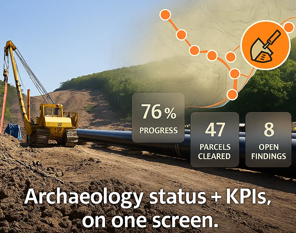
One of our energy sector clients needed to track progress on a pipeline project. The ask was simple: Can we see all our data in one place—including maps? Not just charts and KPIs, but real-time visibility into archaeological review zones, survey boundaries, and land access.
The Jacobs Digital and Data team answered with a clean solution that didn’t require new infrastructure or extra software. They used Power BI, Icon Map Pro, and the Alluvial platform to bring everything together—without disrupting existing workflows.
Why location data mattered on this project
This work supported a regulated pipeline project that involved strict oversight tied to archaeological and environmental review. Work couldn’t proceed unless specific parcels had been surveyed and cleared. That meant tracking not just what was done, but exactly where it was done.
Spatial data wasn’t optional. It dictated construction schedules, regulatory reporting, and crew coordination.
A map, embedded where it belongs
With Icon Map Pro, the team embedded a detailed web map into the same Alluvial dashboard used to track project status. The map had everything you’d expect from a full GIS viewer—multiple layers, color-coded symbols, and real-time context—but didn’t require a separate login or license.
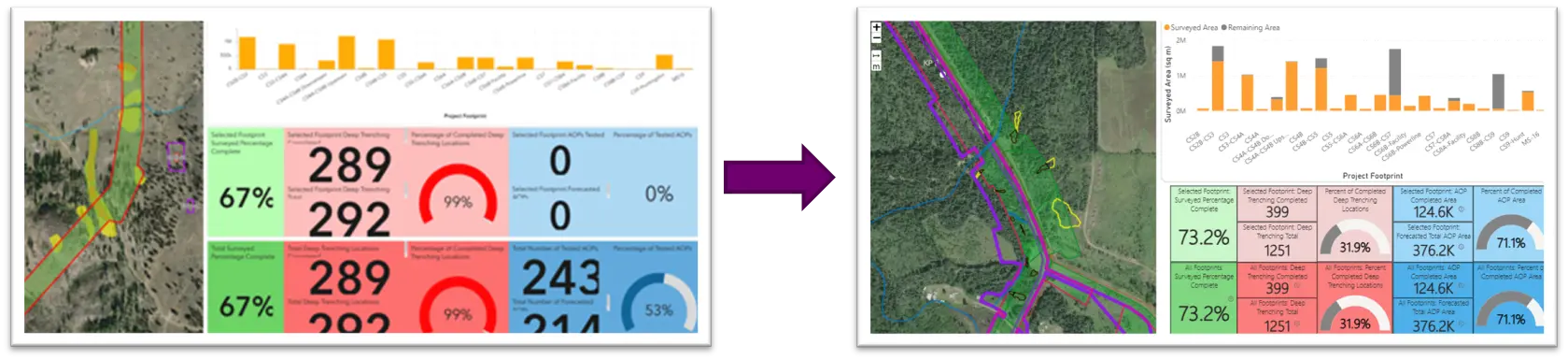
👆 You can’t even tell, but the left is the old app in Web GIS, which couldn’t handle time series well, required published services, and took ages to load. On the right is the upgraded app that loads in seconds in Alluvial.
“We brought in a map you’d normally see in a GIS portal and made it behave like a dashboard,” said Mitch Greenan, a data analytics lead on the project. “It’s one screen. One experience.”
Built on open standards, made to scale
The solution also relies on open source geometry formats, which integrate seamlessly with Icon Map Pro. There’s no need to translate or reprocess spatial data—geometry just works.
And thanks to Power BI and Fabric, there are no meaningful limits on data scale. Whether the data is processed in-memory through VertiPaq or streamed through DirectLake using columnar parquet files, the system performs consistently.
Icon Map Pro stands out as one of the first spatial tools to fully take advantage of this architecture—bridging map rendering with scalable cloud data in a way that’s fast, flexible, and efficient.
No new platforms, just smarter use of existing ones
This approach didn’t require replatforming or migration. Instead, the team connected:
- GIS tools for field collection and desktop editing
- A SQL Spatial database for storage and access control
- Power BI and Fabric for reporting
- Alluvial to deliver the entire experience in one place
No layer publishing. No GIS server maintenance. No redundant workflows.
What changed for the project team
With this update, teams across engineering, permitting, and construction could:
- See where surveys had been completed
- Track which zones were ready for work
- View project progress and spatial data in one location
This simplified weekly updates, improved handoffs between roles, and made decision-making more transparent.
A note of thanks
This work was delivered by Jacobs’ Digital and Data team, with technical design by Mitch Greenan. We also thank James Dales and the team at Tekantis, creators of Icon Map Pro, for helping make this approach seamless and repeatable.
Want to reduce tool sprawl?
If your team is managing spatial and performance data across multiple tools, you may not need to. With this setup, maps and dashboards live in one place. No added infrastructure. No extra friction.